The decision to pursue a rebrand came at a defining moment in Murphy & Company’s history. As the company transitioned ownership, it became clear that its identity needed to reflect both where it had been and where it was headed.

Through months of creative collaboration, I led the development of a design system that balances modernization with trust. The refreshed color palette centers around Digital Violet, a tone that speaks to knowledge, imagination, and forward thinking, paired with Signal Orange, which embodies energy, clarity, and action. Together, these colors represent the foundation of Murphy & Comapny: education delivered with creativity and a dedicated energy toward digital banking advancement.
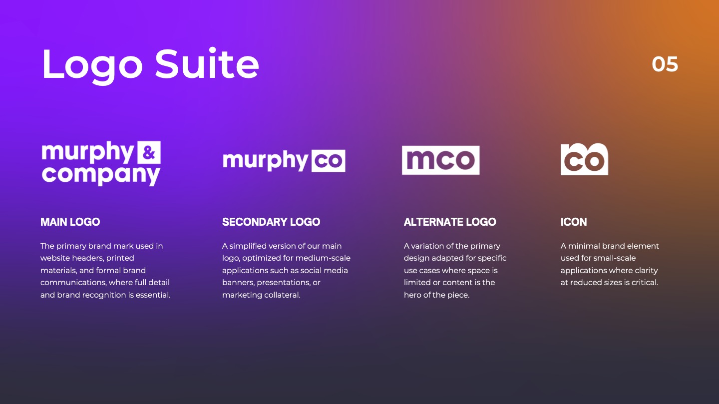
One of the cornerstones of the rebrand was the new responsive logo suite. My team designed four distinct variations to adapt seamlessly across any platform. This flexible system allows the brand to remain consistent and recognizable whether it appears on a large display, a mobile device, or a business card. It reflects Murphy & Company's commitment to thoughtful design and attention to detail in every interaction.